
You may know that I am a huge fan of Hans Rosling, a man who could make population statistics come alive. Although he passed away a couple of years ago, his book and his TED Talks continue to be as relevant as ever. i urge you to do a search on this web site where you will see what I mean.
But today I came across a web site that is filled with insightful graphs derived from demographic data about our world. Unlike listening to Hans Rosling who was not shy about telling you what conclusions you should draw from his marvelous animated graphs which took you from the past right into the future often by finding relationships between two apparently unrelated data sets that actually show clear correlations much like we also saw in the wonderful book Freakonomics, these graphs present visually powerful snapshots of current data on a single topic or show historical trends on that topic, also sometimes with projections.
Our World in Data and the SDG-Tracker are collaborative efforts between researchers at the University of Oxford, who are the scientific editors of the website content; and the non-profit organization Global Change Data Lab, who publishes and maintains the website and the data tools that make their work possible.
Just to give you a sample, there is a lot of discussion among developed nations about public vs. private health insurance. Here is a graph showing the European countries with the most people insured publicly. https://ourworldindata.org/grapher/public-health-insurance-coverage?time=1975
In comparison, this graph shows that the US is movin toward more privatization of health insurance.
https://ourworldindata.org/grapher/us-healthcare-expenditure
Here is another graph showing projections for world population growth and its impact on world population.

The number of graphs created by the this team is mindblowing. Have a look for yourself:
https://ourworldindata.org/#entries
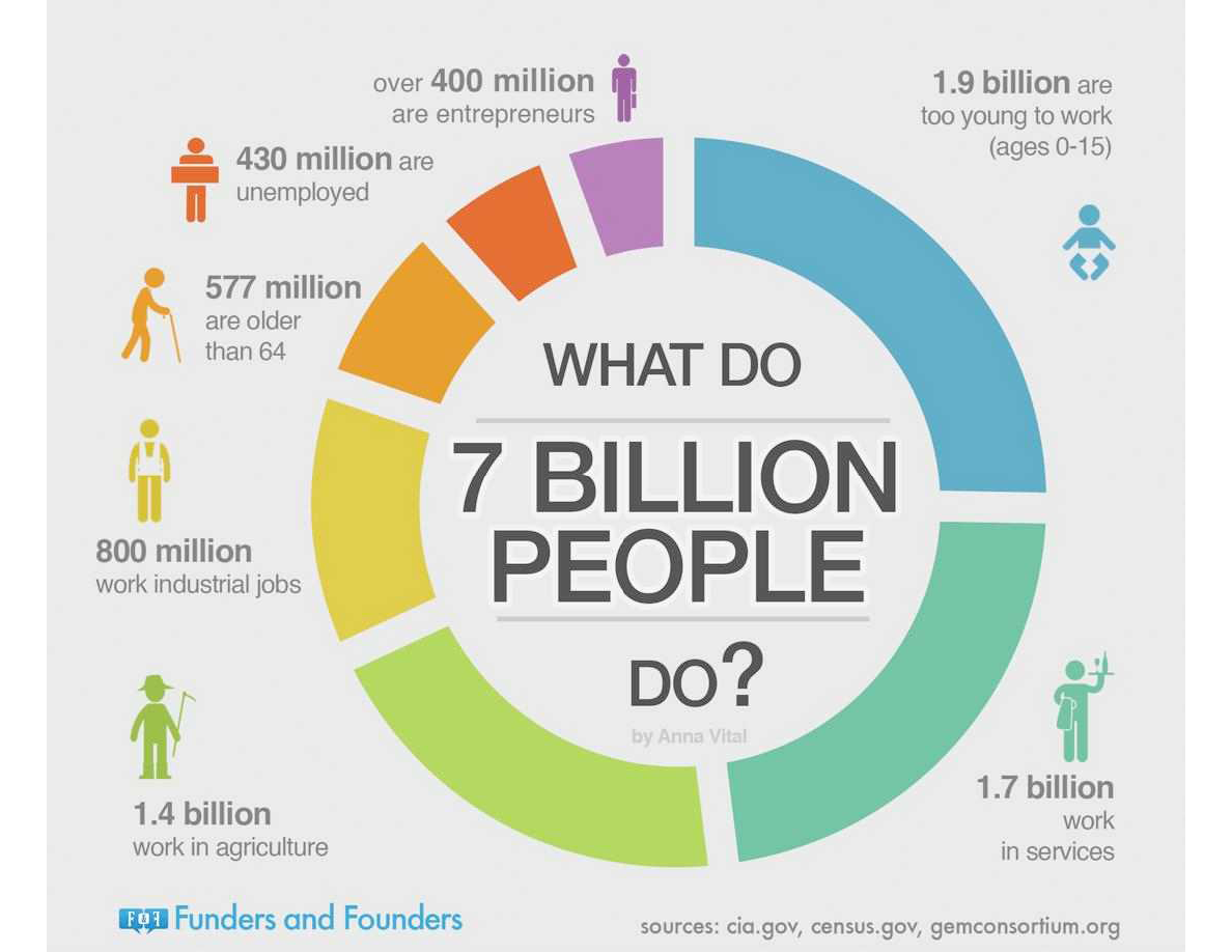
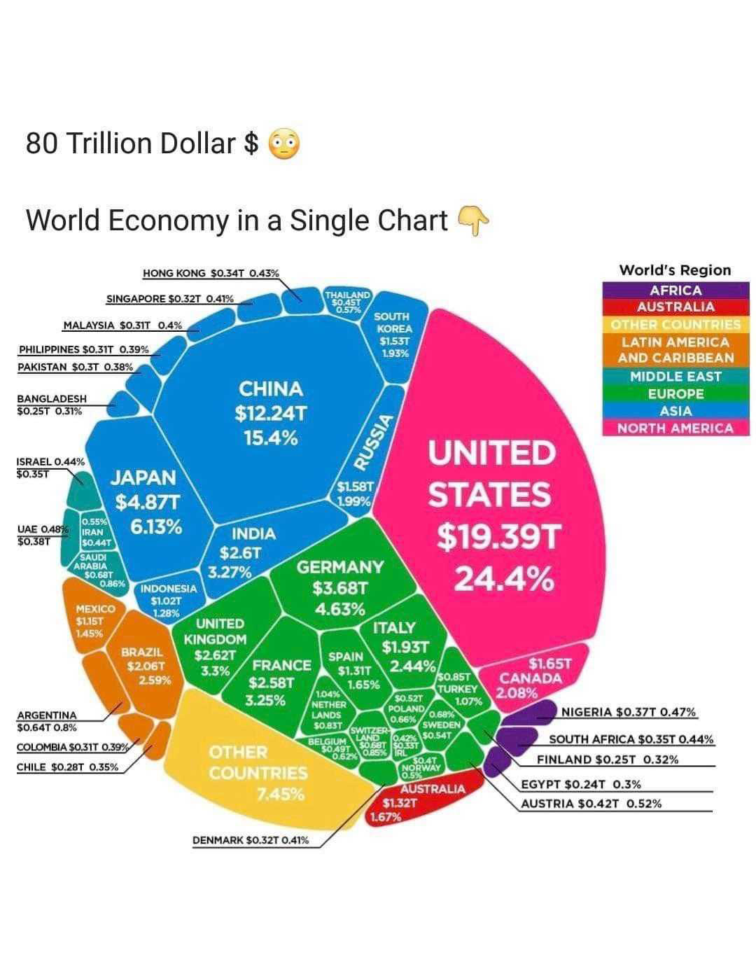
As if this weren’t enough, a friend sent me some very compelling graphs under the name “The World in Charts”. Unfortunately I have no attribution for most of them but I felt you deserved to see them.
I hope you find them interesting.
Herb