

Polarization and disconnectedness seem to be the motto of the time we are living in. Populism, tariffs and closed borders are just two manifestations. I think we need to realize that we are all in the same boat together and can navigate important issue like migration and climate change if we think and act together. That’s why I was attracted to three TED Talks, all of which focus on understanding data through visualization
Manuel Lima’s TED Talk is called A visual history of human knowledge.

Traditionally, the metaphor of a tree has been used to illustrate human genealogies or societal hierarchies, but Lima offers us another way to imagine this: the network — the same kind of network that fascinated and shocked us when the concept of Six Degrees of Separation became popular a few years ago. (see related blog post)
How does knowledge grow? Sometimes it begins with one insight and grows into many branches; other times it grows as a complex and interconnected network. Infographics expert Manuel Lima explores the thousand-year history of mapping data -- from languages to dynasties -- using trees and networks of information. It's a fascinating history of visualizations, and a look into humanity's urge to map what we know. Lima is also the author of The Book of Trees: Visualizing Branches of Knowledge.
His 12 minute TED Talk has had nearly two million views. Have a look for yourself. click here

Lima’s ideas may remind you of another much-loved person of the TED universe, the late Hans Rosling. See my posts on Factfulness and Rosling Retrospective. Another author and speaker working in this genre is David McCandless, who turns complex data sets (like worldwide military spending, media buzz, Facebook status updates) into beautiful, simple diagrams that tease out unseen patterns and connections. Good design, he suggests, is the best way to navigate information glut -- and it may just change the way we see the world. McCandless wrote Knowledge Is Beautiful: Impossible Ideas, Invisible Patterns, Hidden Connections and gave a TED Talk on The Beauty of Data Visualization, which you might find interesting. As someone who coaches many presenters, I would love to see people take more effort to replace their endless lists of bullet points on the PowerPoints with some powerful graphics to represent the data and concepts they are talking about.
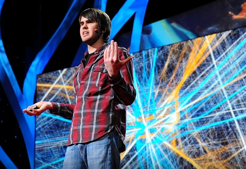
And finally let me introduce you to artist Aaron Koblin who takes vast amounts of data -- and at times vast numbers of people -- and weaves them into stunning visualizations. From elegant lines tracing airline flights to landscapes of cell phone data, from a Johnny Cash video assembled from crowd-sourced drawings to the "Wilderness Downtown" video that customizes for the user, his works brilliantly explore how modern technology can make us more human. Here is his TED Talk.
Herb